Strauss & Co. art autions app
I was responsible for UI/UX design for the Strauss & Co. app. I worked with a small team that included one Frontend Developer and a Project Manager with Backend being managed on the client's side. The team followed an Agile development process. We worked in two week sprints with a client presentation at the end of each sprint.
Context
Strauss & Co Fine Art Auctioneers is South Africa's leading fine art auction house. Providing quick and confidential art valuations and live and online auctions. They contacted Fastcomm to enhance their mobile user experience by making their website functionality available in an app.
Home page evolution
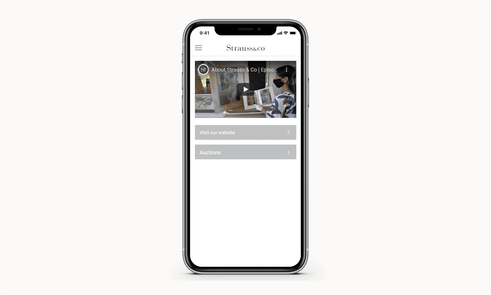
Version 1
The first version of the home page was created in development during the first sprint where the goal was simply to publish the Strauss app. Each card on the home page pointed users to the website at this stage.

Version 2
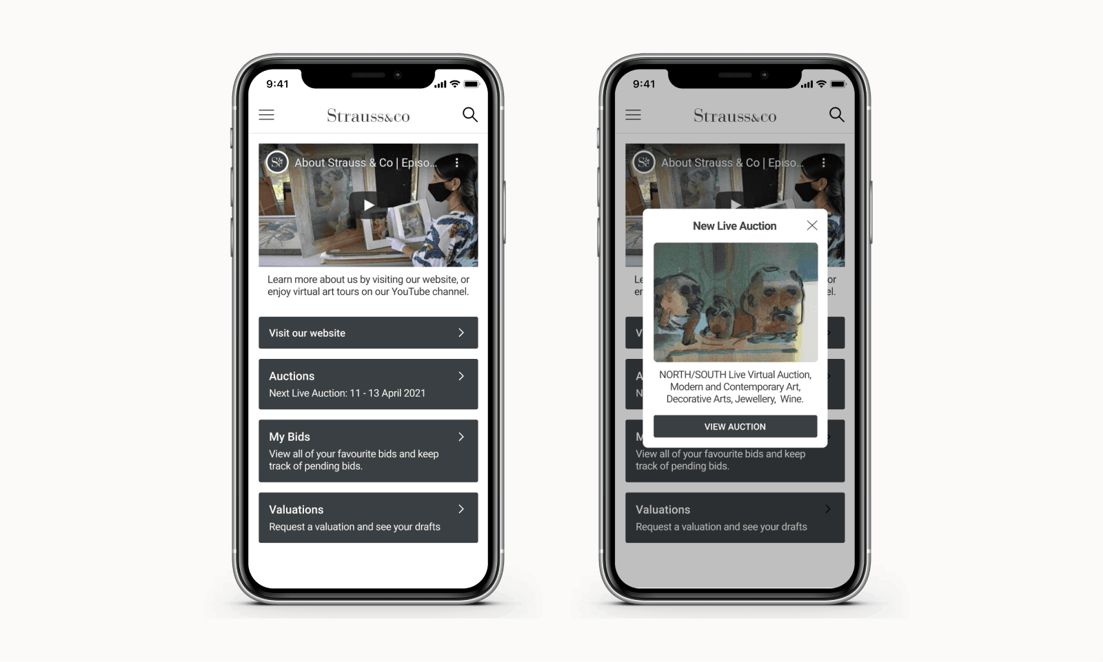
In this iteration of the home page, the original layout was extended to accommodate more functionality in the app. During this sprint, the focus for design was on other parts of the app. I worked with the developer make a couple of small improvements:
Readability was improved by using a darker background colour for the cards.
Descriptions were added to the last three cards to better guide users.
Auctions could now be viewed in the app. A modal was added to inform users of a new live auction. This modal was a quick solution but quite disruptive. An improvement can be seen in version 3.

Version 3
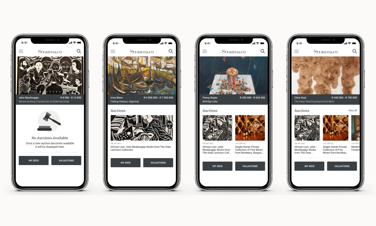
This iteration was created in a sprint where time was allocated to home page design. I conducted competitor research and considered the website experience that Strauss clients are familiar with. The following improvements were made:
The Strauss YouTube video was replaced with the same carousel of upcoming art pieces that can be seen on the Strauss website. These images are chosen to entice art lovers to register for upcoming auctions.
The auction modal was replaced with an auctions rail, where current and upcoming auctions can be seen. The layout of this section changes depending on the number of auctions available.
Outside of viewing auctions, users can keep track of their bids and submit art for valuation. These features are accessible directly on the home page for ease of use.

Search by artist
Strauss has an extensive database of information on previous and upcoming lots organised by artist. Users are able to search for the artists they are interested in and see a history of their pieces sold in previous auctions.
Creating an mobile experience where users can easily navigate such a large database was a challenge.
Users can search for a specific lot by name of description or they can browse by artist instead.
When browsing by artist, the most popular artists were highlighted at the top of the page.
An alphabetical index of artists was made available. To ease navigation of this extensive list, users can jump to alphabetical sections at the top of the list and easily scroll back to the top by using a floating button.
Navigating from the home page to a lot for one of the top featured artists
Filter by artist
Auctions at Strauss are divided into sections that include a large number of lots. During an auction, users must move fast to bid on their favourite pieces. Effective filtering was needed to support users during a fast-paced auction.
Users can filter sessions by category, artists, makers or designers, and wine producers. They can also set their preferred estimated price range.
The artists filter includes search functionality to help users navigate the long list.
Users can select artists and choose to either exclude all other results like a traditional filter does, or exclude the selected artists instead. This option provides flexibility for users to browse and bid in the way that works best for them.
Filtering an auction session to exclude certain artists
User testing
User testing for the Strauss app was conducted in small mock auctions before any big feature was launched. These sessions simulated the fast-paced nature of a real auction well and users were quick to point out any challenges they had. To enable more user centered design I would have liked to include user research during the design process as well.
What I learned
Working on this project I saw the value of working iteratively in an Agile environment to achieve a large goal. The Strauss app includes a lot of complex functionality, only some of which is presented here. Close collaboration between design, project management, development and stakeholders enabled us to strategically ship new features to users while receiving valuable feedback to inform future improvements.